French toast
Description:
French toast comes out best if you work with thick slices of French or Italian loaf bread that are several days old. That way they've had a chance to firm up, which will make the slices hold up better when you dip them in the egg milk mixture and fry them. Thin slices of fresh bread tend to fall apart or get mushy when you do this, making for lousy French toast.
Prep Time
5 mins
Cook Time
15 mins
Total Time
20 mins
Servings
4 servings
Ingredients
- 4 large eggs
- 2/3 cup milk
- 2 teaspoons cinnamon
- 8 thick slices 2-day-old bread (better if slightly stale)
- Butter (can sub vegetable oil)
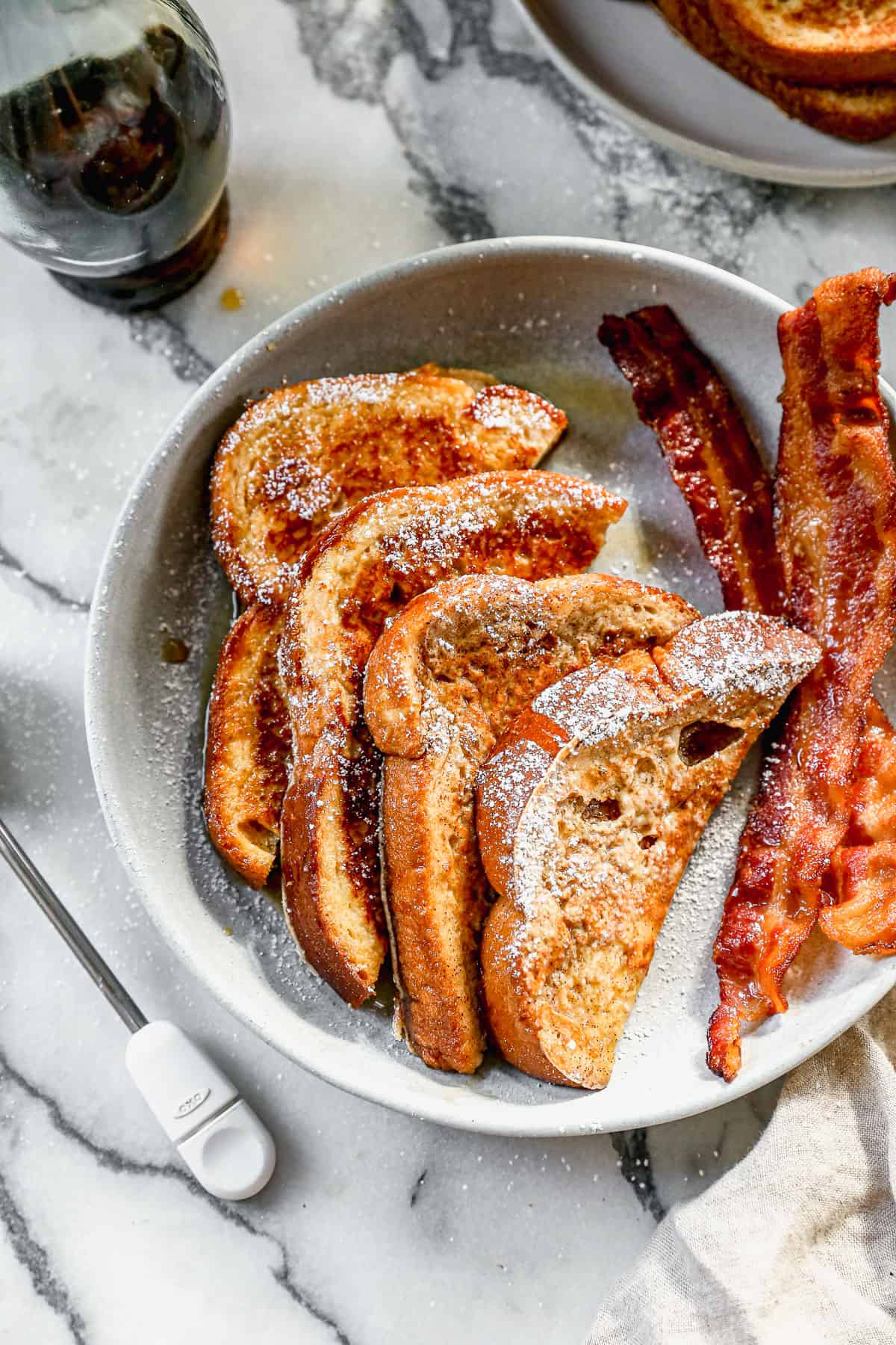
- Maple syrup
Method
-
Make the egg mixture: In a medium bowl, whisk together the eggs, milk,
and cinnamon.
:max_bytes(150000):strip_icc():format(webp)/Simply-Recipes-French-Toast-Method-Shot-1-15d1929a7418444da983f44ab4b72025.jpg)
-
Soak the bread slices in egg mixture: Place each slice of bread into the
mixture.
:max_bytes(150000):strip_icc():format(webp)/Simply-Recipes-French-Toast-Method-Shot-2a-80f40e2c94584ce39bfd54a3ae394660.jpg)
:max_bytes(150000):strip_icc():format(webp)/Simply-Recipes-French-Toast-Method-Shot-2b-ff5edd7c004246b69b752b6e4ca6c765.jpg)
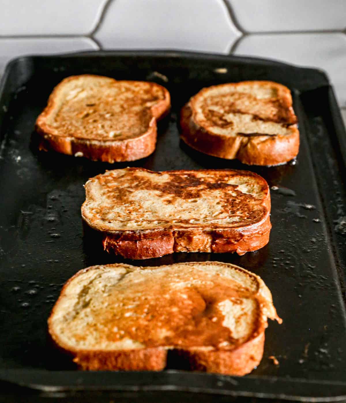
-
Fry the French toast: Melt butter in a skillet and cook slices until
golden brown.
:max_bytes(150000):strip_icc():format(webp)/Simply-Recipes-French-Toast-Method-Shot-3-94d5ef75bf2f414d90a8b4f3ba9a0eed.jpg)
:max_bytes(150000):strip_icc():format(webp)/Simply-Recipes-French-Toast-Method-Shot-4b-bcaca55fa7674e0689023e5f09b47150.jpg)
-
Serve: Serve hot with butter, maple syrup, and/or fresh berries.
:max_bytes(150000):strip_icc():format(webp)/Simply-Recipes-Best-French-Toast-LEAD-1-ef3c1a8a9a31473aa0daded249a2b1df.jpg)
Nutritional Facts
455
Calories
15g
Fat
59g
Carbs
13g
Protein
source: simpley recipes.com
Research evaluation: Link to Google doc
Sample imagery


Recipe website:
- "Food and Friends"
The site have a clean, well-organized recipe listings with clear headings and subheadings, and a good amount of whitespace so each recipe card stands out. The use of categorized recipe layout with ingredient and directions and readable typography makes it easy for users to scan the informtion quickly. It also shows consistency in how each recipe is presented across the whole website.
- Taste better from scratch
This site uses large, inviting photos right up top and clear section headers which help readers quickly find what they want. The recipe includes helpful notes and tips that increase usefulness.
- Serious eats
This site gives a strong explanation of why certain methods or ingredients work, which teaches the reader not just performs. They also have a “Jump to recipe / Expand” navigation to let people skip directly to the part they want, which is helpful. Their design is polished, using good typography, spacing, and visual hierarchy, so the recipe is easy to follow.
Non Recipe website:
- The SavvyCal Blog
This site have a clean typography, great spacing, minimal distractions. Important content is easy to read and scan. They often include table-of-contents breakdowns in long articles, which help with navigation and keeping users oriented.
- Lumenart space
This site communicates through striking visuals, clean typography, and large amount of whitespace, creating an elegant, focused layout that highlights the art. It shows how strong imagery and minimal text can set a clear mood and guide users smoothly.
- Luminaire authentik
This site ephasizes a stylistic design approach that likely relies on product photography and a clean interface. Both demonstrate how visual storytelling and clear hierarchy can make a site engaging. I can also use large food images, clear section headers, and plenty of whitespace to keep the layout inviting.